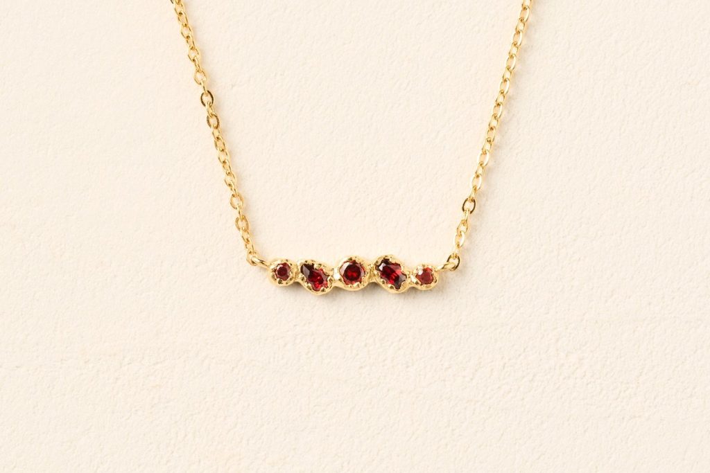

A necklace can be beautiful and still sit in the wrong place. The useful question is not whether every piece matches, but whether the jewellery leaves enough room for the collar, the face and the other details to be read clearly.
Jewellery is often chosen one piece at a time. An earring looks right in the tray, a pendant seems to suit the colour of a blouse, and a ring adds the small lift that the outfit appeared to need. The difficulty begins when those good decisions are placed next to one another. A pendant disappears into a V-neck, an earring competes with a high collar, or two coloured pieces sit so close together that neither has room to register.
The solution is not a general colour formula. Jewellery operates at a smaller scale than clothing, and its position matters as much as its hue. Warm metal catches light near the skin; a coloured detail creates a defined focal point; a collar introduces an edge that can either frame the piece or interrupt it. Agapée's current Koré designs make these relationships easy to study because the forms are clean and the coloured surfaces are controlled.
This test starts with spacing. Put on the top first, stand at the distance from the mirror at which another person would see you, and notice the empty areas around the neckline and face. Then add one piece. The goal is not to fill every gap. It is to decide which gap deserves attention and which should remain quiet.
Begin with the collar, not the jewellery box
A crew neck, an open shirt and a square neckline create three different maps. The crew neck gives you a firm horizontal line close to the face. A short necklace may crowd it, while a longer pendant can create a deliberate vertical route down the centre. An open shirt already provides that vertical route, so a medium pendant may look more natural than an extra-long one. A square neck has corners and negative space; jewellery that repeats too many hard angles can make the area feel busy.
Before choosing a necklace, trace the neckline with your eye and find its lowest point. The pendant should either sit clearly above that point or clearly below it. When it lands exactly on the edge, the chain and fabric keep interrupting each other. That small collision is why a good necklace can look strangely untidy in photographs even when it seemed fine while getting dressed.
The same rule helps with layers. If a jacket lapel or cardigan opening will cover part of the chain, test the jewellery with the outer layer closed and open. A piece that only works when the jacket is arranged perfectly is not a dependable choice for a real day. Leave enough separation for the metal outline to remain visible as you move.
Let colour be a point, not a colour scheme
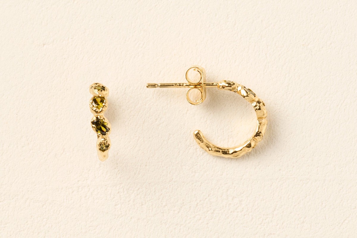
A coloured detail is useful because it brings a precise note of colour without asking the whole outfit to follow. A red pendant can warm a charcoal knit. Green hoops can sharpen a white shirt. Celadon can soften black or navy. None of these pieces needs an identical shoe, bag or belt. The colour earns its place by being small, clear and deliberately located.
When two coloured pieces are worn together, separate them by distance or by scale. Strong hoops near the face can be paired with a quiet metal necklace, while a coloured pendant can work with a ring because the hand sits far enough away for each detail to have its own moment. Coloured earrings and a coloured necklace can still work, but one should be visibly smaller or less saturated so the eye knows where to begin.
Check the outfit in ordinary light. Bright retail lighting makes polished metal and coloured surfaces look more forceful than they will on a grey commute or in a softly lit restaurant. If the colour almost disappears in natural light, that may be exactly right for repeat wear. A jewellery accent does not need to announce itself from across the room to improve the outfit.
Use earrings to control the space beside the face
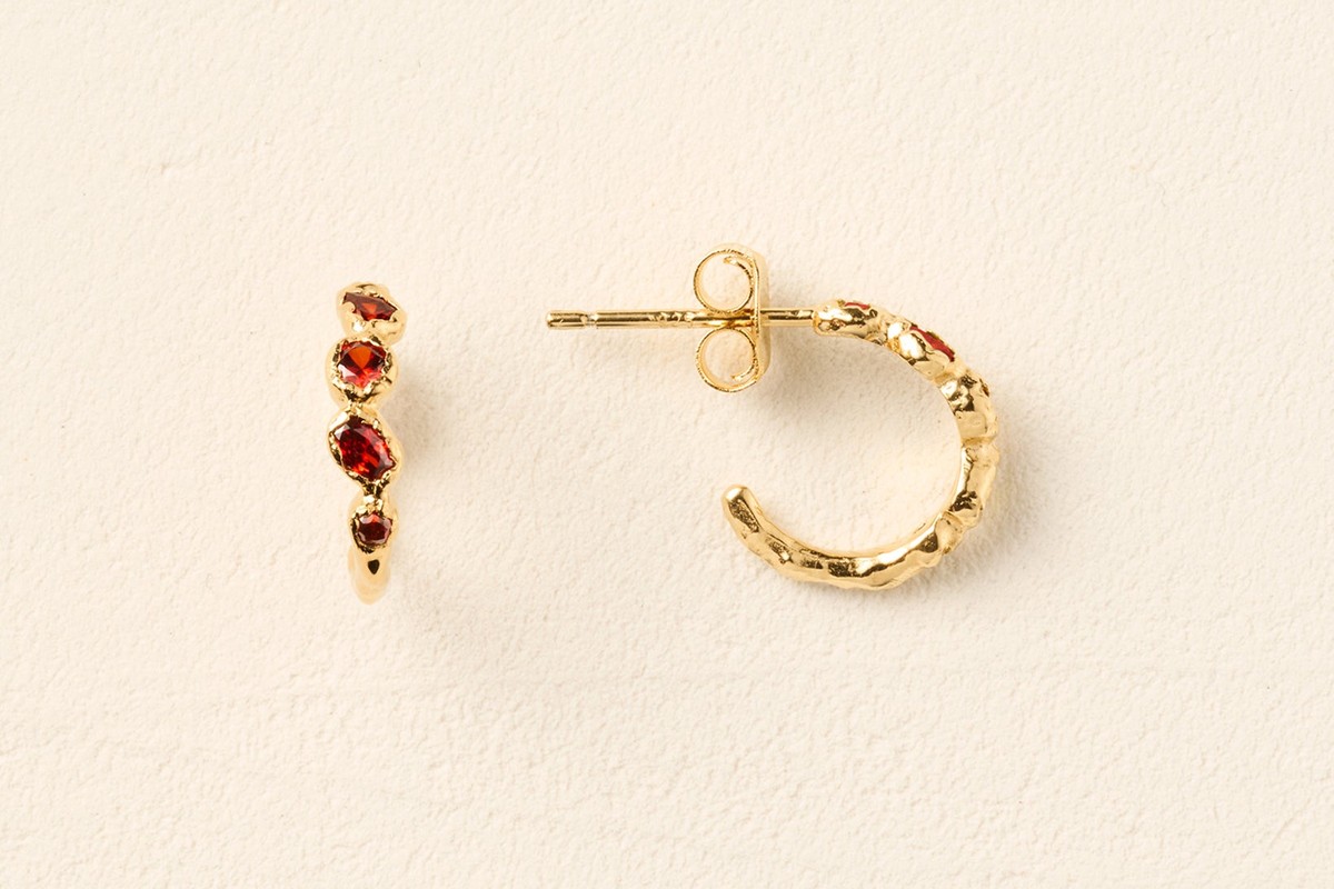
Earrings sit inside a crowded area: hair, glasses, collars, scarves and makeup all compete nearby. A hoop with a coloured section is already doing two jobs, drawing a curve and placing colour close to the skin. Give it space by simplifying one neighbouring element. Hair tucked behind one ear, an open collar or a quieter lip colour can be enough; there is no need to strip the whole outfit back.
Length matters more than trend labels. An earring that ends exactly where a high collar begins can create the same visual collision as a pendant on a neckline. Turn your head and see whether the earring repeatedly catches or disappears. A comfortable gap between earring and collar makes the shape easier to read and is usually easier to wear through a full day.
If the earrings are the focus, delay the necklace decision until the end. Many outfits do not need both. The bare area at the neck can act as a pause between the face and the clothing. That pause often makes a small hoop look more considered than adding another piece simply because the chain was part of the original plan.
Move the accent when the neckline is already busy
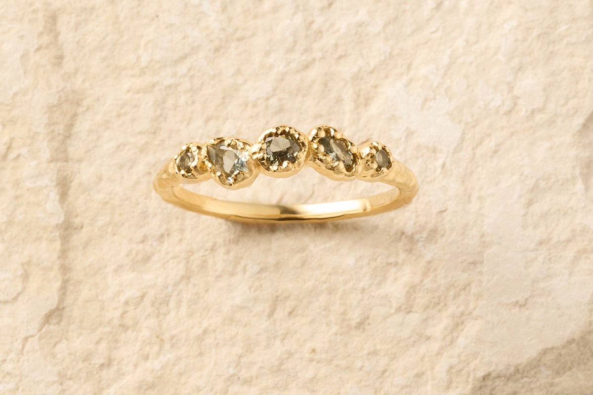
Printed blouses, gathered collars and contrast stitching may leave no clean place for a pendant. Instead of fighting for space, move the jewellery accent to the hand. A ring can carry a coloured detail without crossing the fabric pattern, and it appears naturally when holding a phone, cup or bag. The shift keeps the outfit detailed while avoiding a crowded upper half.
Ring colour does not have to match the print. Look for temperature rather than an exact shade: warm reds with tobacco, cream or rust; clear greens with navy or cool grey; pale celadon beside stone, black or faded blue. These are relationships, not rules. The useful test is whether the ring feels connected to the outfit when the hand rests naturally, not when it is held beside the blouse for comparison.
Keep the rest of the hand calm. Several thin bands can make one coloured ring feel integrated, while another large coloured ring may compete. If sleeves have strong cuffs or buttons, try the jewellery with the sleeves at their real wearing length. A ring that works with rolled sleeves can feel completely different when a wide cuff is sitting beside it.
Photograph the spacing, not just the pieces
A close mirror encourages you to judge workmanship and sparkle. An outfit photograph shows spacing. Take one image from chest height and another from a normal conversational distance. Look for collisions: pendant against neckline, hoop against collar, ring against a busy cuff. These are easier to see in a still image because movement is no longer smoothing over the problem.
Save the combinations that work, particularly when a particular neckline is difficult. The point is not to build a rigid catalogue of outfits. It is to remember useful distances: this chain with this open shirt, these hoops with this collar, this ring when the print is doing enough near the face. Those small records reduce the urge to buy a new piece for every awkward outfit.
Over time, the pieces that cross several necklines and several levels of dress will become obvious. They are the useful core. More expressive coloured pieces can then be chosen because they add a specific effect, not because the jewellery box lacks colour.
The best arrangement usually leaves something out
Good jewellery styling is often subtraction disguised as confidence. One clear pendant, one coloured hoop or one ring can carry more atmosphere than three pieces competing in the same small area. Spacing gives each object a reason to be there and gives the clothes enough quiet to remain visible.
Agapée's coloured and gold-toned forms are useful for testing these relationships because the colour is concentrated and the silhouettes are easy to compare. Start with the neckline you actually wear, choose the point that needs attention, and let the rest of the arrangement breathe.